Google is continuing to experiment with changes to the bottom search bar on Android devices. The company is trying out an interface design that includes a search bar, for access. The current Google Search version has a search bar at the bottom with access buttons, for “News” “Images” and “Videos”. In contrast this new test presents a design by integrating the search function into the bar.
With this update, the prominent bottom search bar merges the search field directly into its real estate. This combined method eliminates the necessity, for a search bar positioned at the top of the display. Even though it may occupy space at first it results in an organized layout where the search function is consistently accessible.
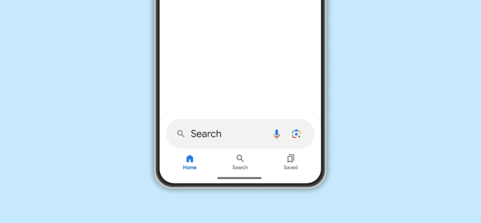
The Redesigned Bottom Search Bar

The updated lower search bar features design components inspired by Material You, including tabs shaped like pills. It comes in a fixed color, than adjusting based on themes. Only a select group of users currently have the opportunity to try it out. Theres potential for a release if the response is favorable. The aim seems to be to create consistency among Googles apps, on both Android and iOS platforms.
Only time will tell if the bottom search bar redesign is an improvement or not. Although it enhances the visibility of search it could potentially overshadow results. Google will assess user interactions and feedback as part of this test as is customary, with any feature. The company regularly refines the user experience so this particular design iteration is likely one of several being explored.